
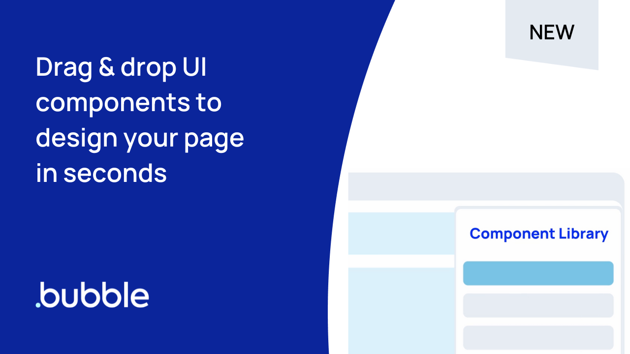
Starting from a blank page can be intimidating. With Bubble’s new Component Library, you no longer need to. In minutes, you can complete beautiful, responsive landing pages with our new set of pre-built components like signups, logins, headers, heroes, footers, and more! Try it out yourself.
Once your UI is set up, connect your pages to workflows for deeper functionality, all with Bubble’s powerful no-code development platform. In this post, we’ll show you how to get started with building a web app using components, especially if you are new to learning Bubble.
What is the Component Library?
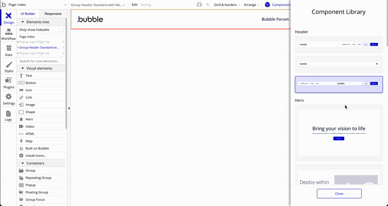
The Component Library is a growing set of drag-and-drop, customizable building blocks for user interfaces that make it easy for new no-code learners to quickly set up their first app pages and more intuitively start building and customizing their web applications.
Most of our users start with designing the landing page of their app, so we’ve released five different categories of pre-built components aimed at landing pages, including heroes, headers, footers, signup/login forms, and value propositions – housed in the new Component Library sidebar in the Bubble editor.
How do I use the Component Library?
If you’re new to Bubble, the first step is to sign up and create your first app.
To get started with the new Component Library, head to your Editor. You can follow the onboarding guide to drag & drop any component into your editor’s responsive column layout.
Customizing your components
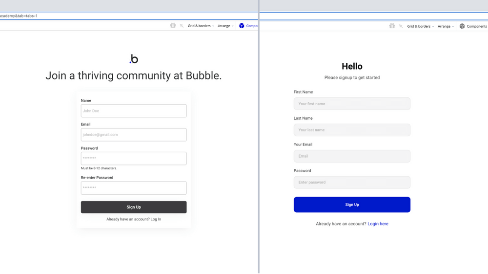
Once you are done adding components, you can customize them to fit your own product’s brand, from logo to colors, styles, fonts, and more.
Adding styles, transitional animations, and custom conditional states in Bubble is easy in the Styles tab, with a few new features we’ve recently launched to support the Component Library. These include:
Learn how to use styles effectively and you can save yourself time and make branding a breeze. Watch our video on how to save yourself time with design using styles & variables:
How do components like login & signup work?
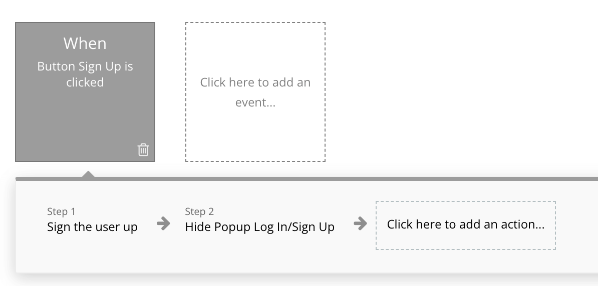
You will probably have noticed many of these components have buttons for login and signup.
Unlike basic website builders, Bubble allows you to connect and customize your buttons (and all other elements) with workflows. Workflows are a powerful way to connect your Bubble app's design to key functionality. All Bubble apps come with a pre-built "User" data type that makes login & signup easier to set up.
Examples of workflows you can build with your components:
- When your header's Signup button is clicked, Open the Signup section of your Signup/Login Popup (conditionally showing only the Signup Group)
- When the Login button is clicked, Open up the Login section of your Popup
- When your popup's Signup button is clicked, Sign the User up with the email and other info they filled out in the Popup's Inputs
If you're new to Bubble, here’s how you set up your first workflow:
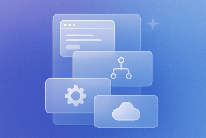
Other workflow actions you can link your components to include:
- Navigation - help navigate the user across pages in your application
- Data (things) - read and write data to your application
- Email - send emails to users on behalf of your app
- Payments & analytics, custom actions from plugins, and more!
You can learn more about building workflows on our Academy and in our manual.
What else will I be able to do with components?
In the future, Bubble will be releasing more components and more in-editor guidance on how to connect these components together.
Down the road, we’re also looking at ways to enable users to generate their own custom tokens and components, to continue supporting our community’s endless creativity that inspired this work.
We can’t wait to see what you build!
Build for as long as you want on the Free plan. Only upgrade when you're ready to launch.
Join Bubble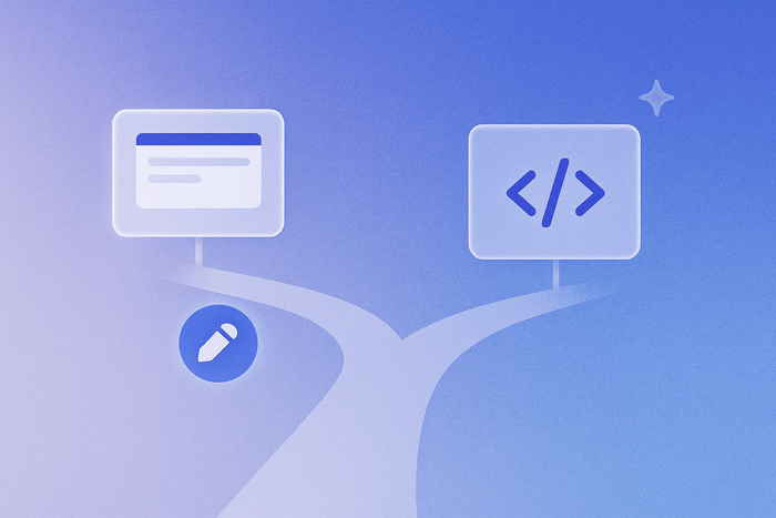
